
Print Magazine
The Regional Design Annual is Print Magazine's largest issue each year. The content is a selection of work from all parts of the United States, broken into several regions. The illustrations represent designers from different cities. Each character has props, clothing, and a personality derived from these cities. There are multiple designer "in-jokes" including a Helvetica t-shirt, Greta Grossman lamp, spray mount, and a Muji bag.
Final Cover
Section Openers

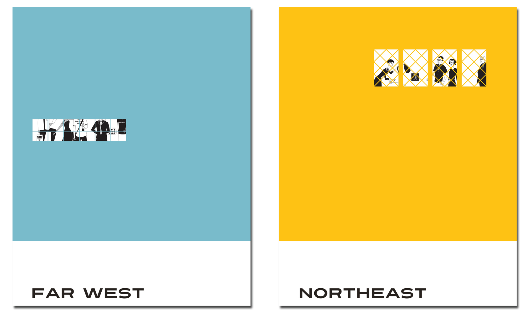

Options and Character Information


Print’s Regional Design Annual—the most popular issue of the year, the issue that brings you a comprehensive survey of graphic design in the U.S and features 350 winning designs chosen by esteemed judges—is finally here. The truth is, we should stop here, bring this blog post to a screeching halt in the second sentence—because we all know that to really experience the RDA, you need the real thing in your hands.
But we’re not going to do that because as it turns out, we do have a little something we can share with you exclusively online, so long as you do yourself a favor and get the actual RDA as soon as possible.
Once you do, you’ll likely wonder, Who illustrated this amazing cover?
That would be Sean Adams, a former partner at AdamsMorioka in Beverly Hills who’s been recognized by every major competition and publication and exhibited often including a solo exhibition at The San Francisco Museum of Modern Art. Furthermore, Adams has been cited as one of the forty most important people shaping design internationally in the ID40.
Needless to say, his involvement with the RDA took it to an entirely new level of greatness.
“When designing for other designers, we either do our best work, or strike out,” Adams says. “It forces me to work that much harder, and push beyond the comfortable. Designing a cover for a magazine, especially Print, is a great assignment. It’s a tiny poster that needs to impart information, content, and hit someone over the head from across the room.”
Adams notes that the most challenging part of designing the cover was the audience. “In this instance, it’s other designers, and people I know. Even though I’d like to believe I have a hardened core oblivious to criticism, the reality is that there is always that little voice inside, Are you sure you want to do this? I mean, really?
Also, I’m not an illustrator. I took drawing and anatomy at school, but that was a long time ago. Drawing a hand in the right position on a hip is not as easy as it sounds. The Art Center Library has a great collection of books and cds for figure drawing. Each one has multiple poses by nude men and women. This was incredibly helpful, but proved awkward at a presentation when my desktop was filled with the little thumbnails of nudes.”
“My first impulse was to base each character on a specific designer,” Adams says. “But, since we almost all wear the same identical black outfits, this proved tricky. The solution came together when I stepped back and let each character have his or her own personality. In my head, each one has a name and backstory. Determining which items defined these was a wonderful challenge.”