Stationery: spelled with an "e" for envelope
My friend, Kathy McCoy, recently asked if I had any Herbert Bayer images from his Colorado days. She checked with Lou Danziger who pointed out that we were the caretakers of his monumental slide archive of graphic design. After I pulled everything together, it was obvious that Bayer designed a lot of stationery, and I mean a lot.
The world is screaming insanely, "Print is dead, print is dead, the end is near!" People may not be using letterhead for a casual note that can work on email, but they still use it in more formal situations. The good part of this is that clients want the best stationery with the options, not the down and dirty cheapest one. Now it really matters.
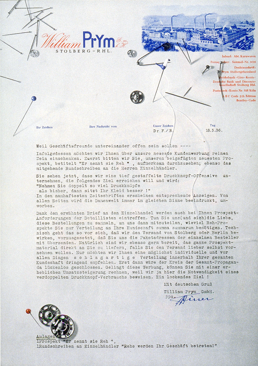
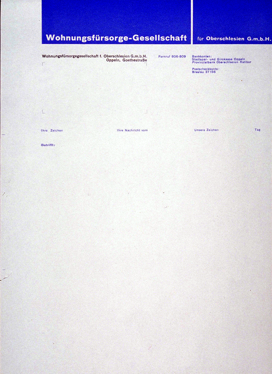
Bayer designed most of these at the Bauhaus and before he emigrated to the United States. The letterheads are all asymmetrical, use the golden section as a guide, and are designed for functionality. Since Modernism demanded that functional should be paramount, this makes sense.
When I design a letterhead I like to help the user also; add a short rule to delineate the fold, put a bullet where the date is typed, and guides that identify the margin.
Bayer takes this a little more seriously by identifying the location of every type of information. I'm certain that nobody tried to use too small of a margin or fail to line the date up with the type. I get the sense that this would have been a pretty serious infraction and all hell would break loose in the halls of the Bauhaus.