Un Año De Amor
Signage is serious. People may not find a restroom in time. They may get lost and miss the Gap. If you are a signage designer you must be serious. You must make big, black, monolithic directories that include serious information. There is no room for fun. None. Don't even think about color. Helvetica, red and black dammit!
Urban signage is hard. There are multiple committees made up of government officials who previously worked at the Department of Motor Vehicles. The signs need to be clear in a complex and changing environment. They need to withstand weather, vandalism, climbing children, and birds. These are the factors that lead to the 2001: A Space Odyssey black monolith directories.
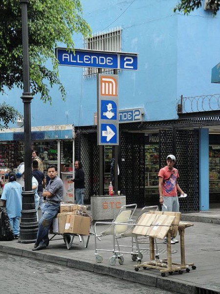
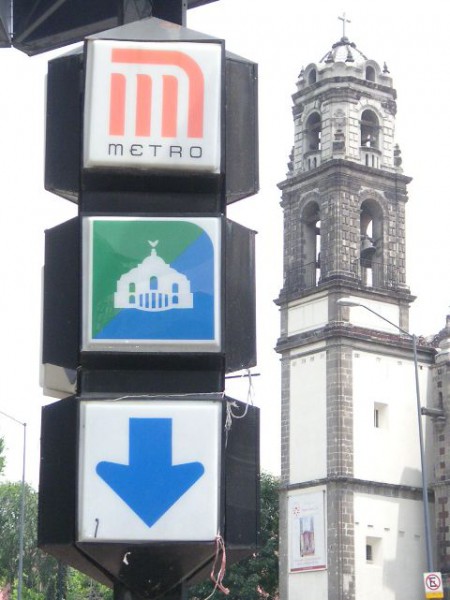
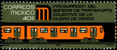
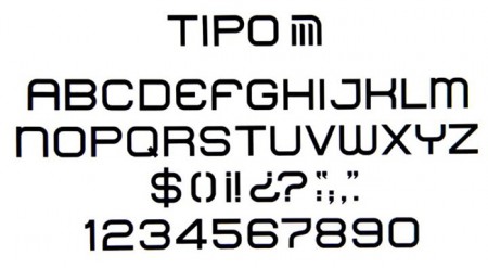
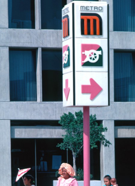
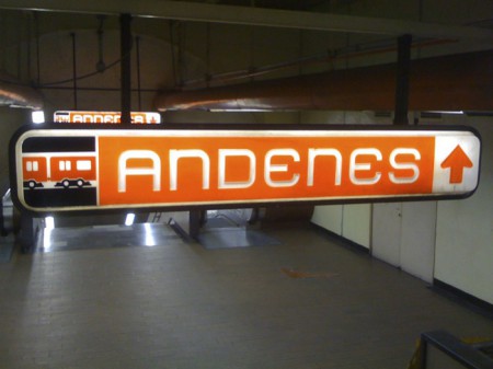
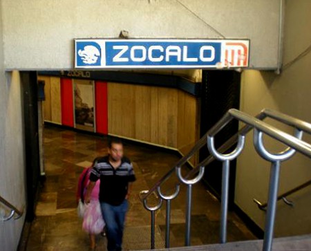
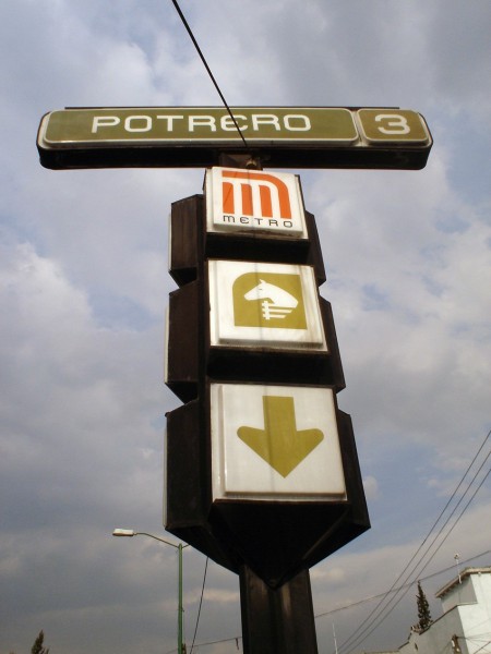
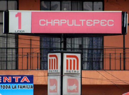
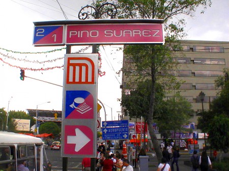
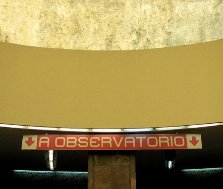
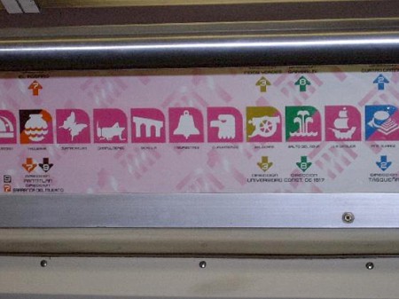
Lance Wyman's system for the 1968 Mexico City Olympics are what every Olympics tries to outdo, and nobody has come close (sorry to my friends who have designed some of these. they're swell, but not 1968 Mexico City). But, today I want to talk about Wyman's program for the Mexico City Metro from 1969. This solution achieves all the difficult goals, but maintains a sense of exuberance and joy. The program reflects a Mexican color palette and sensibility. And it looks like it was fun to design. How can a subway system with orange, pink, teal, and avocado green not be magnificent? I would ride the Los Angeles Metro all the time if it had icons of grasshoppers, sailing ships, and a duck for a station.
Wyman's work is a beacon of optimism in a dull, drab, and serious world.


