Sideways
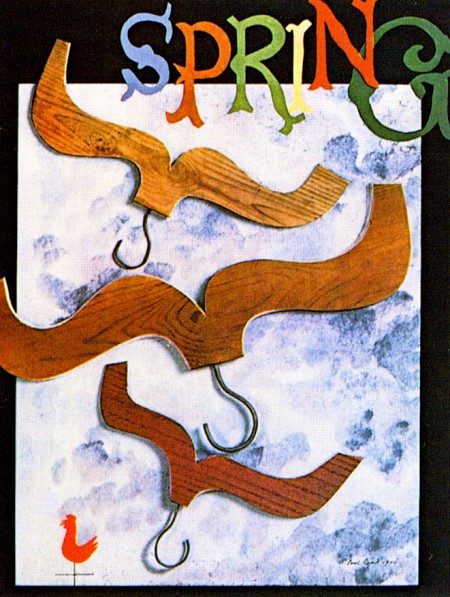
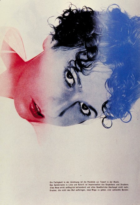
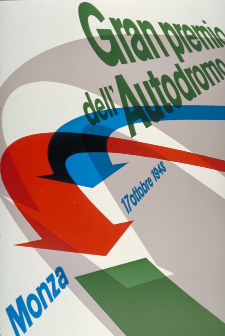
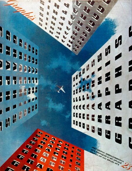
There are times when a project just looks bad, like dog crap. I slave over it endlessly, and then I realize all it needs is to be turned on its side or upside down. Voila, it works. That's the issue when you don't print anything out and only see it on a screen. Sure you can turn your screen upside down or turn it on its side, but that could result in dropping it. The easiest solution is to send a file to print and than flip that baby around in all directions. What was once banal and expected becomes avant-garde and unsettling.
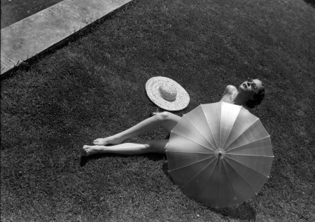
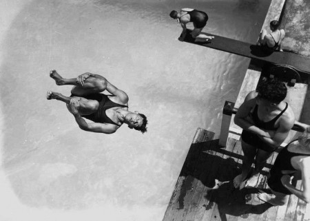
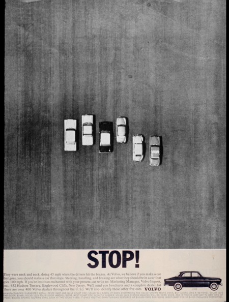
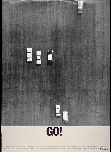
I love work that is sideways or upside down. It gets away from the standard point of view that we have in everyday life which is straight on from about 5 or 6 feet tall. Miraculously, you can see a different view from above or below, or lying on the ground and seeing the world on its side. This is why God gave people bendable joints. Photography at the Bauhaus in the 1920s and 30s took advantage of this ad-nauseum. It was as if everyone there was climbing up the walls and hanging from the balconies. But the images are wonderful.
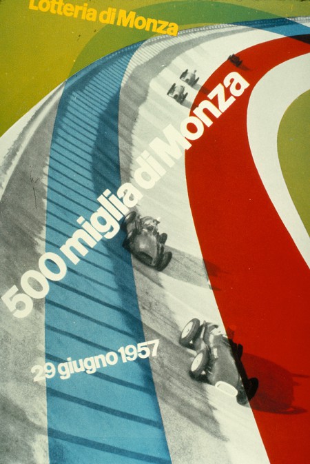
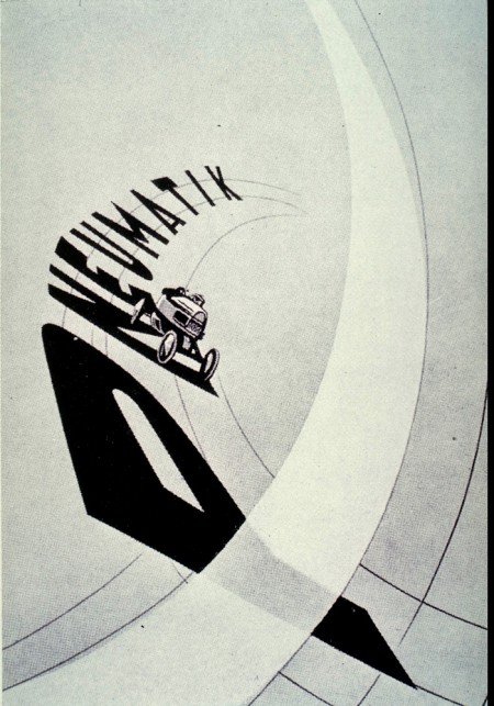
Posters and ads with moving vehicles are especially adaptable to this technique. Gan Hosaya's 1969 poster for Yamaha is one of my absolute favorite pieces of design ever produced. Think how dull it might have been if he simply let the image be turned 90 degrees. So the next time you're out taking photos, climb up on a table and shoot everyone from above. You'll be asked to leave, but end up with a snappy photo that isn't the same head and shoulders of someone holding a drink.


