The Big Story
Lately, you may have noticed a longer time between postings here. Yes, of course, I’ve been busy. A new term at Art Center just began; I’m working on a new book, several time intensive projects, and heading to the Dice conference tomorrow to speak. Nevertheless, I’ve been busy for years. The saying, “If you want something done, ask a busy person,” applies to me. The issue is graphic design. I spend all day with it. I teach, write, and yammer on about it. Lately, when I think about posting something I look at possible design pieces and think, “I am so over this.” Don’t worry. It’s a passing phase, and I’m bound to find some design I’m inspired by soon.
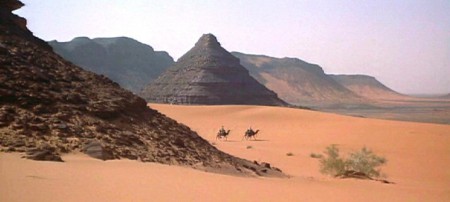
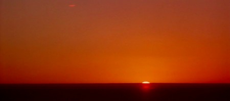
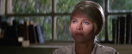
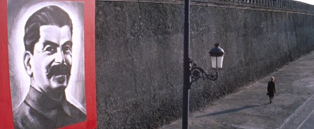
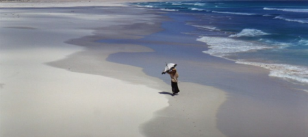
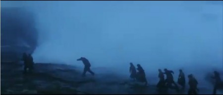
To escape typography, I watched Doctor Zhivago, Lawrence of Arabia, and Ryan’s Daughter again recently. They are all remarkable. If you haven’t seen these, they aren’t what you think. Yes, Doctor Zhivago and Ryan’s Daughter are love stories. But they are played out on such a vast scale against epic times. And, they are extraordinarily and exquisitely designed. David Lean’s vision is clear and refined. Julie Christie (who looks remarkably like Paula Scher) is the most beautiful woman who ever lived. The Panavision cinemascope and color is unbelievable. These are big, big, big movies. This is what a movie is supposed to look like.
I admit, there are some aspects that didn’t age well. Everyone’s makeup in Doctor Zhivago is a little heavy and runs toward a groovy 1965 dark eyes, light lips look. As T. E. Lawrence, Peter O’Toole captures a complex and troubled character, but he should have said “no,” to the third application of mascara.
Finally, there is a scene in Ryan’s Daughter that is my favorite in any film. It’s only a moment, when Sarah Miles lies on the forest ground and looks up. The camera points up to the tree's canopy. There is no music, only the sound of the rustling leaves and creaking of the branches as they barely move in the wind.


