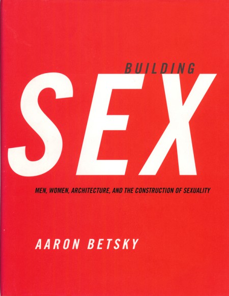
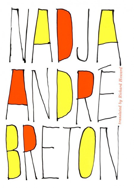
Words and No Pictures
Designers often ask me what I look for in a portfolio. I always look at typography. There are a million decisions and variables in type. If someone can manipulate the complex issues of legibility, form, scale, and meaning with combinations of 26 letters, and create something wonderful, they can probably manage any project. But what makes good typography? It’s not about choosing beautifully drawn typefaces (but that’s a big part), or setting everything at 4 point (some of us like to read the words). It isn’t about maintaining a rigid Swiss structure (but that’s a good place to start). It’s about making a dynamic, exciting, and meaningful experience.
I’ve seen solutions that are incredibly elegant, but make no sense. A refined cut of Didot is probably not needed for a poster about seal clubbing (the animals and blood, not the musician and nightclubs). I don’t like typography that's just nice. There’s enough boring stuff to look at already. If the type is classical and elegant, it should be so beautiful that you want to throw up. If the subject, such as The Angry Black South needs simple communication, let it be just that: simple communication. I like to think of typography as pictures of words. Which makes the statement, A picture is worth a thousand words,” a very complex math problem.


