The Circus is a Wacky Place
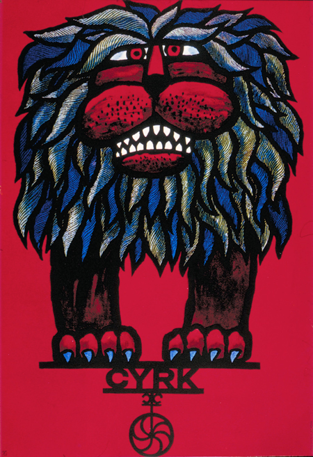
As a design student, I was repeatedly told to study Polish poster art. This was in response to my work that was deemed, “too tasty, too polite.” I spent hours looking at these posters and..., nothing. They made no sense to me, and I could not understand what they meant, how they arrived at this odd aesthetic, or what they had to do with my work. Today, I realize the value of these posters. They transcend the expected. They follow an aesthetic that is fearless and non-traditional. And they allow for gesture and passion.
Now I find myself suggesting the same thing to my students. My students come back and say, “Professor Adams, I don’t understand what they have to do with my work.” To which I say, "Look at them again."
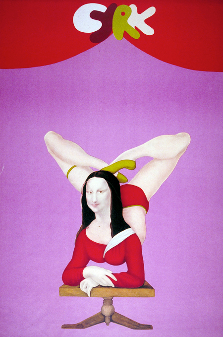
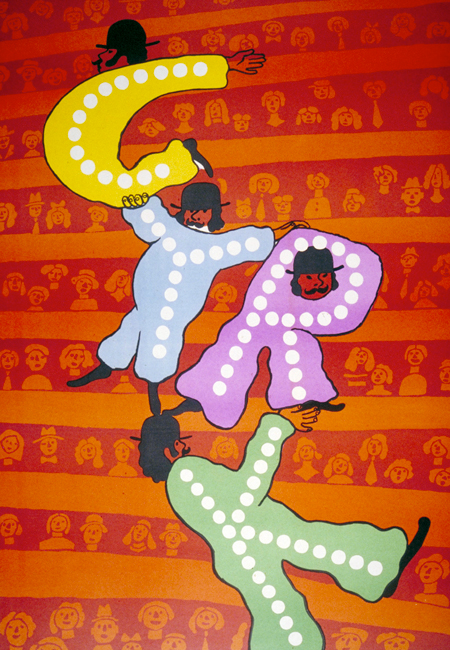
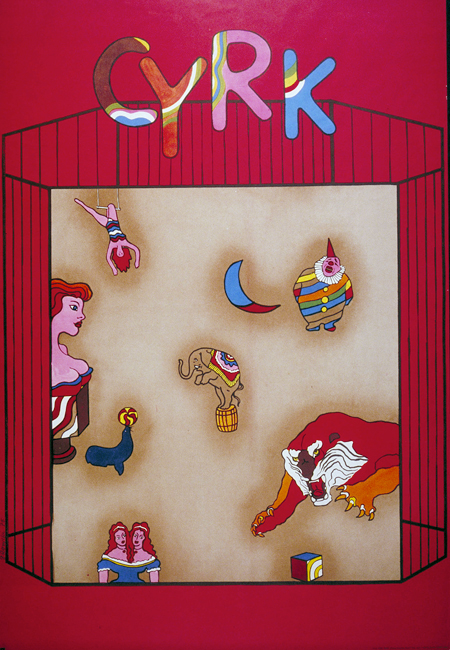
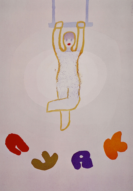
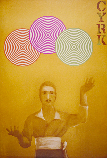
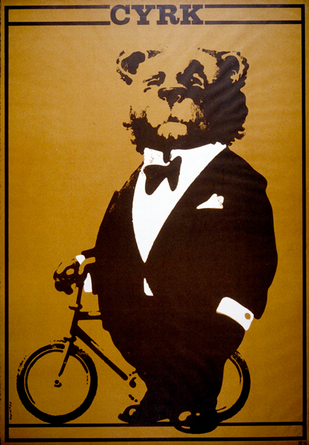
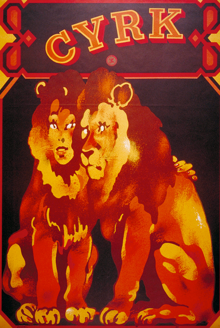
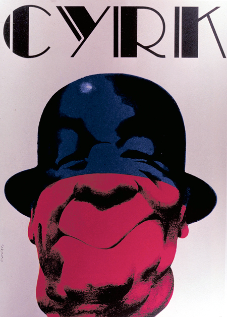
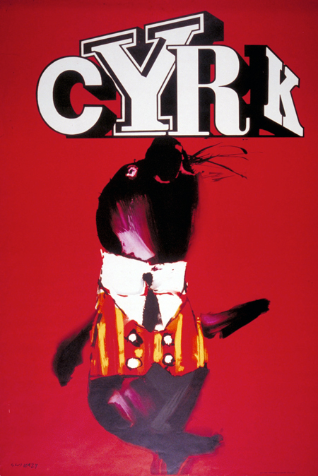
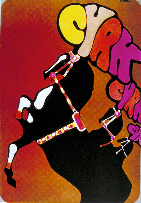
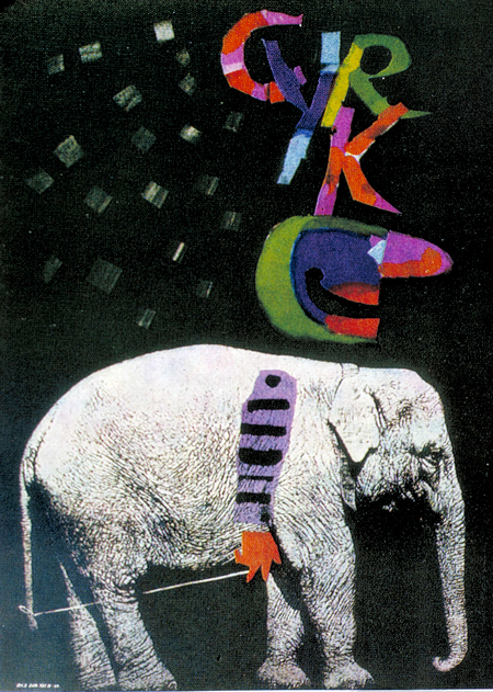
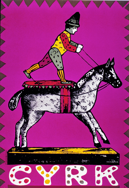
The CYRK (circus) posters were designed during the golden age of polish posters, from 1962 to 1989. The state commissioned these posters to promote a new, modern circus. The designers followed this assignment with non-literal, suggestive forms. Often, these contained hidden anti-Soviet and anti-Communism symbols.
In all honesty, they still mystify me. I can imagine how Josef Muller-Brockmann designed a poster, or Alvin Lustig, or even Yusaku Kamekura. They are beautiful and mysterious, but are from a culture so far removed from my reality, that Martians might have designed them.
from the Lou Danziger Collection
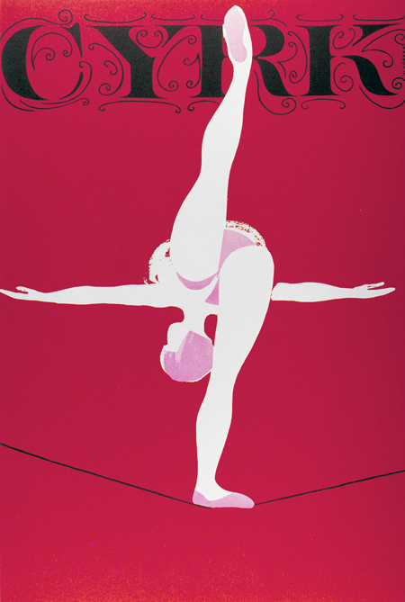
- Wiktor Gorka, 1967
