My Little Town
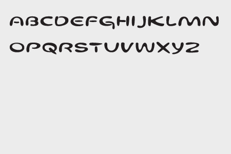
Every once in awhile, I run into Jeff Keedy out walking his dog. I’ve known Jeff for a long, long, long time, since I was 20 years old. This week, I was thrilled to hear that The Museum of Modern Art selected Jeff’s typeface, Keedy Sans, for its permanent collection. Jeff designed Keedy Sans in 1991 and explains its concept, “Most typefaces are logically systematic; if you see a few letters you can pretty much guess what the rest of the font will look like. I wanted a typeface that would willfully contradict those expectations.” I like living in a neighborhood with someone who walks his dog, chats about the weather, and is that smart.
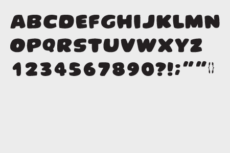
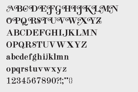
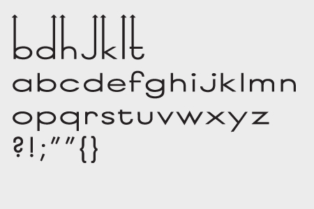
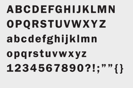
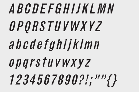
There’s a multitude of incredibly talented designers making wonderful typefaces. It’s not well known, but we make typefaces also. It’s usually in the service of a specific client. We designed “Bob” for Sundance, specifically named for Robert Redford so the in-house designers could never say, “I just don’t like Bob.” We designed Taco for our friend, Larry Nicola’s restaurant, Mexico. We’ve even monkeyed with a font here and there. One of our clients at Cedars-Sinai didn’t like the numeral “1” in Sabon, and I hated the “0”. So we fixed them.
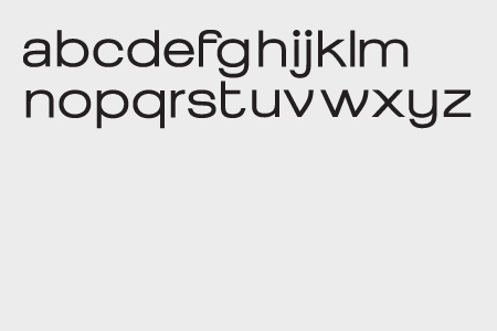
I admit I’m envious of Jeff’s abilities and conceptual approach. In the last couple of years, we’ve forced our interns to design typefaces with questionable taste. I’d love to say it’s because we’re interested in the intersection of decoration, pastiche, and legibility, but I can’t. It sounds mean, but I need them. I don’t know where, but I’ll find a home for them. Maybe I can use Octavia in all caps with swashes for body copy. And I like forcing people to do something that makes them want to go home and take a Silkwood shower.


