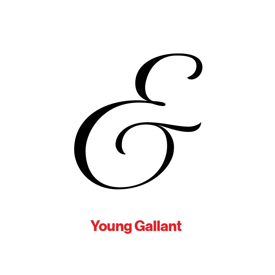
And
I filmed an interview yesterday for a documentary. One of the questions posed to me was, "Why is design important in this instance?" I answered with all the correct statements about value, perception, customer experience, you know the drill. But then I told the nerdy truth. As designers, we love things like a serif that others don't see or care about.
For example, I am a sucker for ampersands. I love the challenge of creating a mark with one, or finding the perfect one for a headline. I once replaced every Garamond ampersand in a book, set entirely in Garamond, with a Sabon ampersand, slightly reduced. Because it was better. Did the final reader notice? I hope not. It should have appeared natural and unobtrusive.
I love the variety of choices from Duchy that is close to the original et (and) in Latin, to the slight variation on that with Cochin Italic, to the pure symbol of Bauhaus. There are some clear winners in the world of ampersand: the Pistilli Roman, Sabon italic, Sentinel, and recently, Museo versions. But, sometimes it's good to be bad. That's when you invite Behemoth, ITC Tiffany Heavy, and City along. But I have a special place for Doyald Young's Young Baroque. That ampersand is fine.


