In Bed with the Bembo
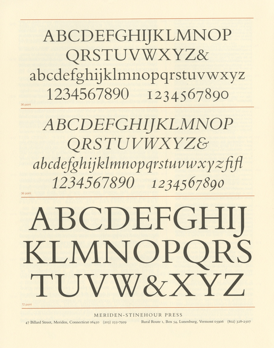
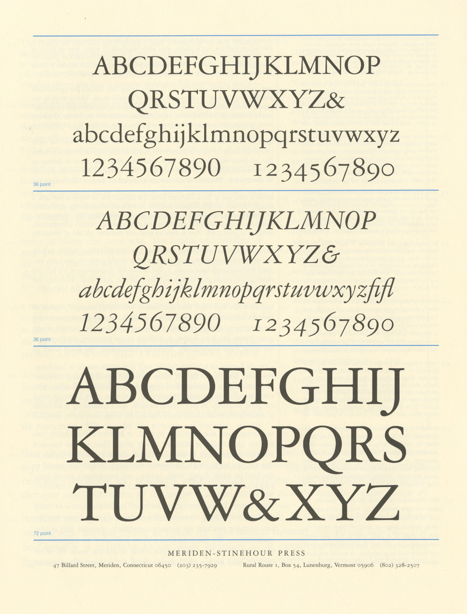
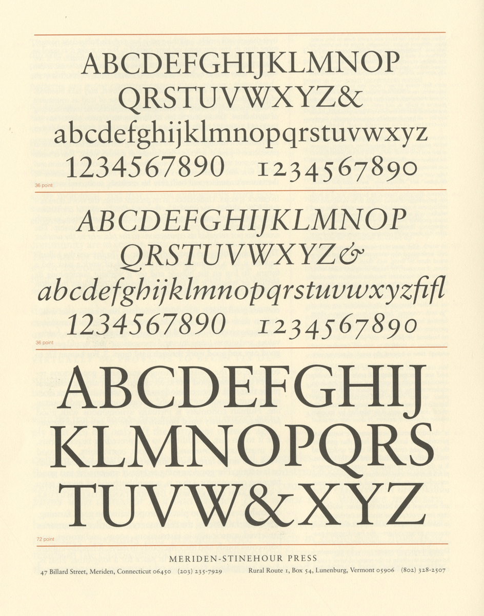
Monotype Caslon, The Stinehour Press, specimen sheet
Graphic design is like cooking. If you want to create a successful meal, you need to start with the best ingredients. If I were a chef (which I'm not since I can only make turkey burgers), I would hope to use fresh organic vegetables and spices. I don't imagine I would do well using Rice-a-Roni and Spaghetti-Os. So why are designers willing to stoop to the Kraft macaroni and cheese (that I actually do like) level when picking a typeface?
"Uh, I think it's Caslon."
"I don't know, maybe it's Weirdnamehere typeface"
"It looks ok to me."
"A friend found it."
These are the statements that are the downfall of civilization. It can't just be some trash Caslon you found working the street for free. You'll get a disease. It needs to be the best possible cut of Caslon. But how do you know if it comes from a good family or is from the wrong side of the tracks?
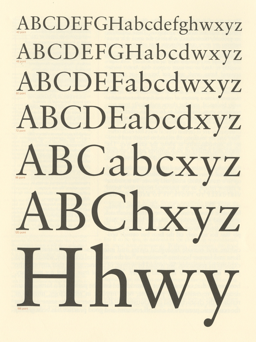
above: Caslon in metal. below: Caslon in digital form
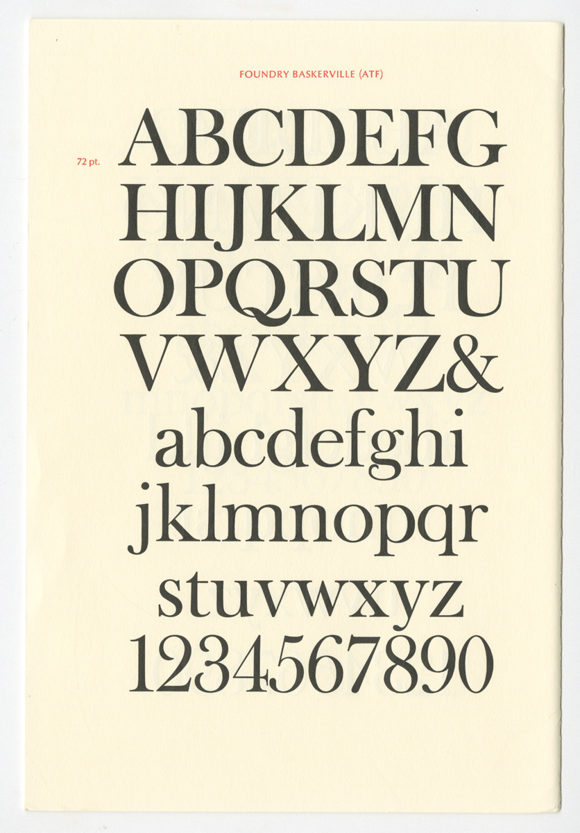
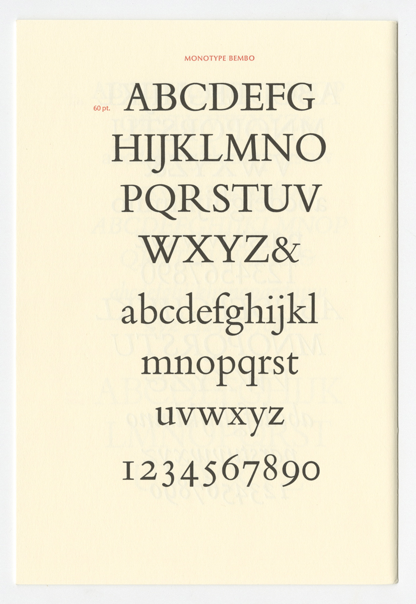
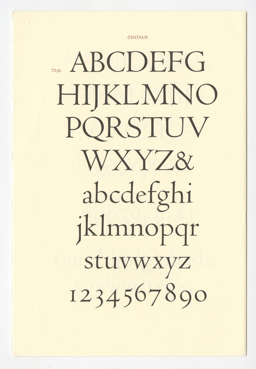
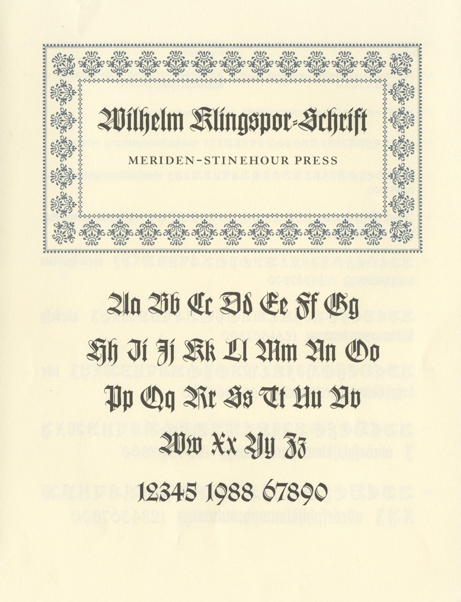
I have a collection of type specimen sheets from Meriden-Stinehour Press. I've had these for almost thirty years. I use these to determine if the digital version is, at least, close to the metal one. Of course changes happen during translation. But I can tell if the ampersand has retained it's original blush of youth or has let itself go.
The lesson here: Stay away from cheap type. Get to know one before getting in bed with it.


