Flowers for Algernon
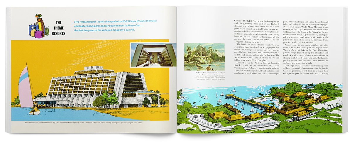
Walt Disney World Preview Center 1971
This week, Jessica Helfand and Michael Bierut were in town for the Design Observer Taste conference. I had dinner with Jessica and she kindly came to school to discuss her new book. If you don't know Jessica personally, you need to understand that she is fast, smart, and hilarious. She also is humble, sweet, and filled with energy. The downside is that I need to stay on my toes. I can't skirt by with funny comments and swearing. This is the big leagues of smart.
On that note, I felt that a post today should engage the reader and focus attention on issues such as the state of the profession, the intersection of fine art, architecture, business, and design, or how stupid the term "design thinking" is. But I was sidetracked by these two brochures from Walt Disney World.
One is from a magazine after the park opened. The other was handed out at the WDW Preview Center before the 1971 opening. These may not challenge the epicenter of design or critical thinking, but the colors are nice. And I'm a sucker for a fancy layout, ochre and purple buildings, and random closeups.


