Marget Larsen
I have a romanticized idea of design in the 1960s and 70s. I imagine the designers of that time sitting at their drafting tables, ordering type, calling an airbrush illustrator, sketching wildly on their large pads, and jumping into their Corvettes to hang at a local Victorian bar with the other designers. Early in my career, I went to Robert Miles Runyon’s office in Marina Del Rey for an internship interview. I recall a woody interior with macramé and hanging ferns. It was very “Regal Beagle” from Three’s Company.
I never met Marget Larsen, she died prematurely in 1984, but I imagine her in this way: “Here’s a sketch,” I imagine her saying to young designer in a white shirt and black tie, “I’m thinking Caslon.” then sitting back and drawing curly-cues. The work is sublime and looks so effortless. Of course, it was probably much more difficult.
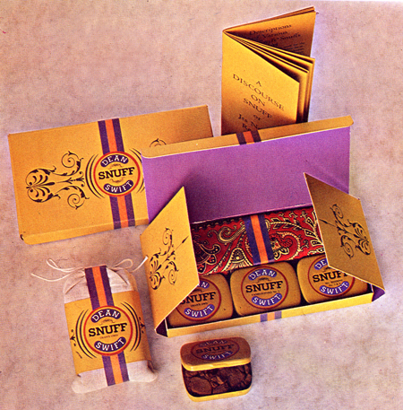
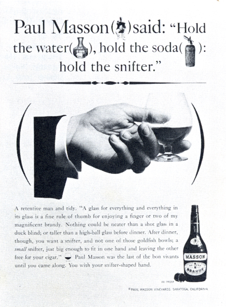
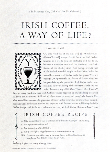
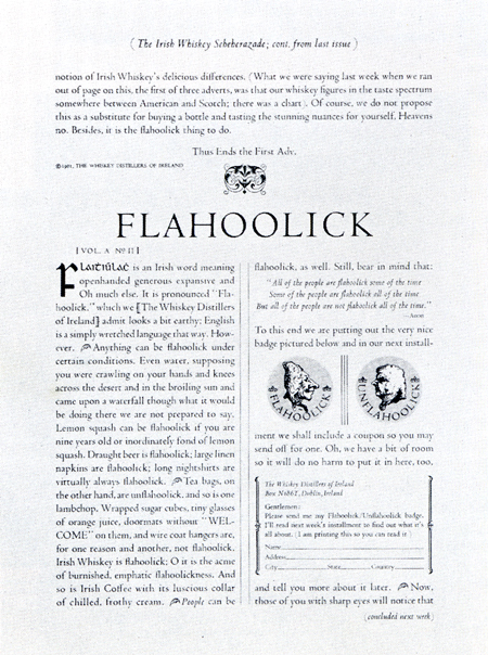
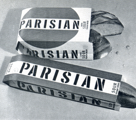
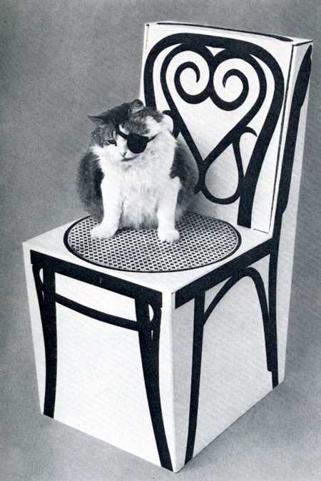
Larsen worked in San Francisco. She worked on ads for whisky, bread packaging, and fashion stores. Her touch was delicate and bold at the same time. There is a slight touch of Victoriana and assemblage in the work. Her sense of typography for ads designed while she was at Weiner & Gossage elevated their genius copy and gave them national standing. These ads move away from the traditional composition of product image, headline, secondary copy and logo in the bottom right corner. They are designed with the presumption that the audience is literate and can read. My favorite Larsen design is the cardboard Thonet chair. It’s one of those ideas that I see and say, “Why didn’t I think of that? Can I copy it and nobody will know?” Since I’m publishing it here, I guess not.
